Here we have created test shots to try and obtain a feel of what the party scene in out video would be like.
Tuesday, 27 January 2015
Test Shots and Problems
Here we have created test shots to try and obtain a feel of what the party scene in out video would be like.

Middle Cover Draft


We thought this image Louis took would be good to use for the middle cover, as it is quite simple and links with our theme. We added a blue gradient like with the front and back cover to add a cold, water feel like the front and back suggests.
We will then play around with font and add some information of the band.

Digipak- Different fonts
 We played with the font on the front cover, but thought using different font types looks tacky and un-professional.
I went onto character and was able to make all the writing block capitals, which gives the digipak a more professional look. Then we spaced out the letters from each other and changed the size. This gives a much more slick look.
We also changed where we put the writing on the front cover, so that you know 'I Will, I Swear' is the artist name, and 'Sleep' is the album name.
 The hair tool we were playing with earlier was also now applied to this image, using a gaussian blur tool to merge the fake hair with the real hair, to get rid of these harsh lines and make it look as if it is floating through the water.
 |
| As you can see here, we used the image of the tree which we edited before, and then added the same photo again but flipped the image. We added the blue gradient, and this looks like it is under water like the front cover. I've also added a barcode here to make the image look realistic as if you could buy it in a shop or online. |
I went onto character and was able to make all the writing block capitals, which gives the digipak a more professional look. Then we spaced out the letters from each other and changed the size. This gives a much more slick look.
We also changed where we put the writing on the front cover, so that you know 'I Will, I Swear' is the artist name, and 'Sleep' is the album name.
The hair tool we were playing with earlier was also now applied to this image, using a gaussian blur tool to merge the fake hair with the real hair, to get rid of these harsh lines and make it look as if it is floating through the water.Monday, 26 January 2015
Digipak -Hair Effect


We found psd images of hair online and have managed to use these to merge with the hair on the girl. We have changed the colour to match the hair by using the hue and saturation, and we can also warp the hair to show that the girl is falling.
We will use this and blend the hair layer onto the image by adding a blur to match the girls hair on the image.
Monday, 19 January 2015
Digipak- Creating a water effect

We had a graphic designer called Ken Coleman who came to our school for a couple of days to help us to achieve the desired look of our digipak. It was a great experience to have him as he showed us very useful and helpful tips on how to get our desired looks for our work.
This image that we got online which some one has created on Photoshop to look like an image under water.
Ken showed us how to the tools on Photoshop to make the digipak look professional and look like something which could be produced in the music industry.
This image that we got online which some one has created on Photoshop to look like an image under water.
Ken showed us how to the tools on Photoshop to make the digipak look professional and look like something which could be produced in the music industry.

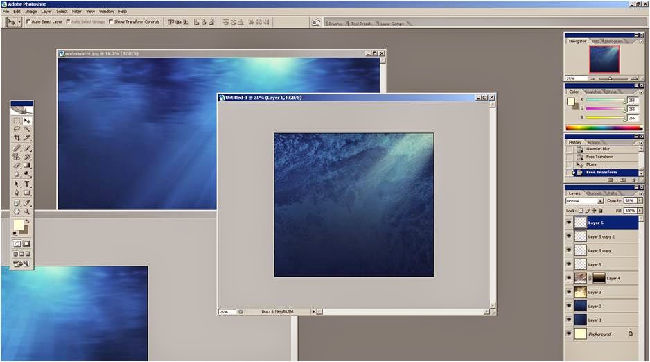


We created this effect on Photoshop, by merging photos of water of that we had taken, layering a blue gradient on top. we then edited the contrast and lighting to make it look as realistic as possible.
We made sections with a white gradient and blurred these to give the effect of light shining into the water, and added them to the top right corner.
We layered the picture of the girl on top, and changed the colours of the image to make her look underwater and to blend her with the picture so she didn't stand out to much. We did this by adding a slight blue tone, representing her looking cold as well.
We then found bubble tools from online (the same as how we found the hair tools), which we played around with to make the girl look like she is floating in the water.
Subscribe to:
Posts (Atom)